iOS 18 Photos app
Role: Independent Usability Researcher
Study type: Evaluative research
Timeline: 6 weeks
This case study was completed as part of a 3.5-month UX Research course. As it was a course requirement, there were no official stakeholders or formal team structure.

Background
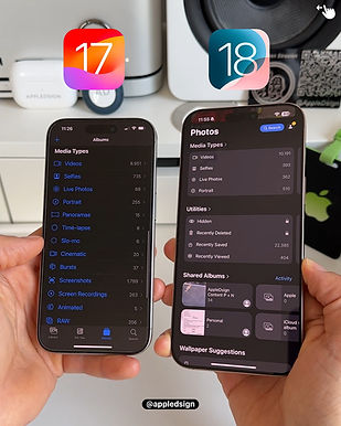
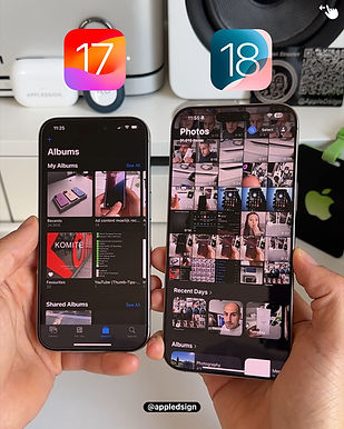
Apple released iOS 18 in September 2024, introducing several enhancements, including iMessage upgrades, security improvements, and bug fixes. While some features received positive feedback, the redesign of the Photos app sparked a lot of criticism. It featured a new navigation layout, automatic categorization, and updated search functionality. While some users appreciated the several customization options, many other users found the changes to be cumbersome, unintuitive and difficult to navigate, leading to widespread complaints.
What are the people saying?
"It seems that Apple is increasingly starting to resemble Android, which is a huge step backward in my opinion."
"I am so tired of the AI stuff in the Photos app that now I want it back where it was around 2015 or so"
"IDK, so far I have just blocked the iOS 18 update and am holding out for any possible fix"
"Photos USED TO BE an app that allowed us to view and organize photos. It no longer is."
Continue the conversation here
Before the update....


Research Goals
Understand how users navigate the new Photos app to uncover underlying behaviors and attitudes
Identify where and why users experience friction with core features and task flow
Deliver actionable recommendations to target design limitations based on synthesized usability insights
Methodology & Approach
Participants
For this study, I recruited 5 participants who actively use the Apple iOS Photos app. All participants were iPhone users and had a history of regular engagement with the app, ensuring relevance to the iOS 18 update. To focus on those most likely impacted by the redesign, I selected frequent users, ranging from weekly to multiple times daily. Ultimately, 2 participants used the app several times a day, 2 used it daily, and 1 used it weekly
Format
I conducted remote moderated sessions via zoom
Each lasting anywhere from 45 - 60 minutes
Approach
Task-based usability tests + think-aloud
Pre- and in-session interviews
Post-task & post-study surveys
Success Metrics
Metric | Type | Measurement | Unit |
|---|---|---|---|
Feature Discovery | Attitudinal | Qualitative | Discovered vs. not discovered |
Navigation Behavior | Attitudinal | Qualitative | First click test, user flow, thematic responses |
SEQ (Single Ease Question) | Attitudinal | Quantitative | Likert scale (1-7) |
Confidence | Attitudinal | Quantitative | Likert scale (1-5) |
Task completion | Behavioral | Qualitative | Pass, no pass, pass w/ difficulty |
Satisfaction | Attitudinal | Quantitative | Likert scale (1-5) |
Scenario-based Tasks
I identified the following as the most prominent and obvious tasks in the new iOS 18 update/redesign of the Photos app and provided context for each when asking participants to perform these tasks for the test sessions:
Task 1: Customizing & reordering collections
Take a few moments to explore the Collections section on your homepage. Without tapping into any one collection or picture yet, scroll and tell me what you notice and how you’d describe what you’re seeing?
Let's say there is section you don’t use as often, how would you make it not visible in your display // And what about a section you don't currently see, how would you make it visible in your display?

Task 2: Search
Let’s say you’re looking for a specific photo, for example, a picture you took of a pet, friend or family member sometime ago. How would you go about finding it?
imagine you need to reference a document for example a receipt, work or school related, anything, no need to open it, just get close to where you’d expect it to be?
Task 3: Clean up tool
Let’s say you want to remove something from a photo, like a person or object in the background. Can you try doing that using your Photos app?
Task 4: Apple Intelligence (AI-Generated Content/Movie Generation)
Let’s say you want to create a memory video using photos from a special event or time in your life, maybe a recent trip, a family moment, or a personal milestone. Can you show me how you’d try to do that using your Photos app?
Analysis
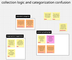
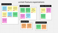
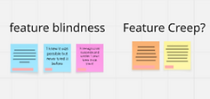
I used Miro to do affinity mapping for my qualitative analysis where i started by grouping user quotes into meaningful categories, sub categories and sentiment. This helped with clearly identifying broad themes and issues within the app. I also used Google sheets to do quick descriptive analysis on the quantitative data i collected to which i mapped with my qualitative data to start developing insights.

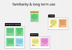
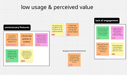


View full Miro board here.
Key insights
Insight #1: Customizing and reordering collections
Customization features exist but feel hidden and unrewarding. Despite all users eventually completing tasks, 3/5 struggled to even discover customization, expecting it to be more accessible than buried at the bottom. Even those who knew it existed found the process unintuitive, with low satisfaction (2.6/5) due to layout of several categories which cluttered the homepage. The study also revealed that when users did customize their layout, it was done to match the previous one they had before the update which led to users not seeing the value in the new redesign; "I could live without it, i didn't need this update at all "

"The app feels clumsy, I shouldn’t need a guidebook to figure it out"- P4
Recommendation: Consider making customization obvious and easy with intuitive interactions and in-app guidance (e.g., drag icons, "Edit" toggles, feedback during layout changes). This helps align the feature with user expectations by reducing the effort invested.
Insight #2: Customizing and reordering collections
AI automation frustrates more than it helps. Users want personalized organization but get presumptive groupings (e.g., memes labeled as "Illustrations," or creating a "trip collection" for work/office visits) that were inaccurate. Users would eventually abandon automatic collections by turning them off saying feature wasn't "very helpful". With no way to easily correct errors or set preferences, the app’s "smart" features often create more work, undermining its goal of simplifying photo management.

"The system often makes inaccurate assumptions, like creating a trip collection when I’d just been going into the office more that week"- P1
Recommendation: Consider introducing user controlled customization within "smart features" "auto generated albums" by allowing users to correct mis-grouped photos and set preferences for what gets auto-grouped. Additionally, consider incorporating lightweight feedback loops (e.g., “Was this grouping helpful?” or “Reclassify this?”) to refine AI suggestions and build user trust over time.
Insight #3: Search
"Search" scoring the highest in usability (5.2/7 ease, 4.2/5 confidence, 4/5 satisfaction), proving to work well for broad queries however it fails for precision. Users rely on search for everyday needs (people, places, date/time, general categories) but hit walls with complex requests ("text in screenshots/documents", niche terms like "memes"). The return in irrelevant matches forces users to fall back on manual scrolling, a breakdown in what should be a time-saving feature. While satisfaction is strong, the dip in ease (5.2 vs. a potential 7) reveals unmet needs for advanced use cases.

"If I searched up something innocuous like sushi, it does not recognize the sushi that was in my photos"- P1
Recommendations:
-
Allow users to further narrow / refine / adjust search parameters when needed.
-
Consider exploring ways to give users more control or input when it comes to organizing / tagging / identifying people or content in their photos.
-
This could support more accurate search results later on and build user trust in the system's intelligence over time.
-
-
Consider centralizing search entry points to help users orient more quickly and layer different search parameters (e.g., people, place, time, type) when needed.
-
A more unified or guided search experience could make complex search feel more intuitive and efficient, particularly for users with “large” or “eclectic” libraries.
-
Insight #4: Clean-up Tool
Overall, the Clean Up tool benefits from intuitive placement, grouped logically with other core editing features, making it discoverable for users who follow standard editing pathways. Most participants who accessed the “Edit” view located the tool successfully. However, the tool’s discoverability still hinges on users initiating the editing flow. In cases where one user relied on less conventional gestures (e.g., press-and-hold on an object), the tool remained hidden. While this may not warrant a full redesign, it reveals an edge case worth considering, especially for users who expect more direct or immediate object interaction.
"I’ve never removed anything from my photos using the Photos app, so I have no idea how to do it" - P2
Recommendation: Consider small enhancements, such as a one-time tooltip, subtle visual cues, or help text on first use, to support outlier behaviors without disrupting the current, well placed interaction design.
Insight #5: Apple Intelligence (AI Content Generation)
While participants P1–P3 demonstrated a mental model aligned with the intended navigation flow (go to the Memories section), others (P4–P5) relied on legacy interaction pattern, like tapping media first or trying to export content into slideshows, likely due to their prior iOS experience or lack of visual prompts directing them to the AI feature.
Users don't necessarily think of “Memories” as a feature that can be created manually. Even those familiar with the section often interpret it as fully automated or passive. Meanwhile, those who want more creative control instinctively go to where they already are (e.g., in an album or collection of media) and look for ways to initiate something from there.
User looked for a “Memory” tab/section and expected to initiate creation from there.
User attempted to build a memory from selected photos or videos using the ellipsis or “slideshow” feature instead.
Confusion on where or how to start memory creation
Recommendation: Consider how the system might better support both entry points: those who begin in the “Memories” section expecting an overview and creation option, and those who begin with media selection expecting a “Make a memory” prompt or clearer AI-enabled call to action.
Conclusion & Impact
Apple is known for frequent software updates and iterative redesigns, but this study highlights a persistent disconnect between system changes and user expectations. Many participants brought legacy habits and mental models into the new iOS environment, often struggling to adapt to unfamiliar interaction patterns or unintuitive pathways. This isn’t a failure of the user, it’s a gap in guidance. If Apple wants to maintain high user satisfaction and reduce friction, it must prioritize not just innovation, but ongoing, embedded in-app guidance that helps users understand and engage with evolving features over time. Ultimately, the success of an update isn't just about what changes, it’s about how clearly and confidently users can navigate those changes.
Reflections & Learnings
Rose

-
Through self-critique and feedback, I observed a noticeable improvement in my ability to ask efficient questions with each subsequent participant
Bud

-
Practice more on building rapport, moderating, probing, and taking notes in order to efficiently manage my time
Thorn

-
I initially administered the Single Ease Question (SEQ) using a 5-point scale. Upon learning that it’s traditionally a 7-point scale, I corrected this during analysis by transforming the scale appropriately.
-
Some follow-up probing may have extended sessions beyond an optimal length, potentially contributing to participant fatigue during task execution
Challenges
-
As an independently led project, my insights and recommendations are not tied to organizational or business objectives, only personal research goals.
-
Two features (Clean Up Tool and AI Memory creation) are exclusive to iPhone 15 series and later. I only became aware of this during analysis, which impacted feature accessibility for some participants. Still, their behaviors revealed important insights into user mental models and discoverability patterns.
Clean Up
Participant | Device Model | Behavior | Outcome |
|---|---|---|---|
P5 | iPhone 15+ | Located and used the Clean Up tool correctly in the "Edit" view. | Pass |
P4 | iPhone 15+ | Located and used the Clean Up tool correctly in the "Edit" view. | Pass |
P3 | Pre-iPhone 15 (presumed) | Navigated directly to "Edit" seeking Clean Up tool. | Pass |
P2 | Unknown | Tried press-and-hold gesture on object; did not locate tool in "Edit." | No pass |
P1 | Pre-iPhone 15 | Used crop tool as a workaround; navigated to "Edit" to look for tools | Pass |
AI Memory creation
Participant | Device Model | Behavior | Outcome |
|---|---|---|---|
P5 | iPhone 15+ | Selected media ellipsis slideshow. Unsure where to go or what to click. | No Pass |
P4 | iPhone 15+ | Selected media ellipsis slideshow. Did not go to Memory tab; AI prompt unclear. | No Pass |
P3 | Pre-iPhone 15 (presumed) | Went straight to the Memory tab and looked for a way to create a memory. | Pass |
P2 | Unknown | Initially considered iMovie, then navigated to Memory tab correctly to attempt creation. | Pass |
P1 | Pre-iPhone 15 | Went to Memory section but assumed it was automated. Wanted more clarity and control. | Pass |